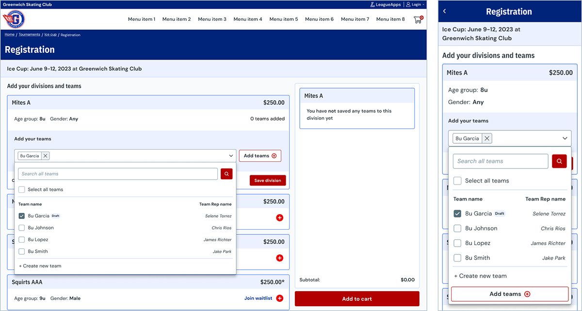
The team had an opportunity to create a whole new registration experience, while doing a technical modernization of the platform. Through user research and data analysis, one significant pain point that the squad identified was a need for bulk registrations. Simultaneously, we took advantage of this opportunity to create a brand new visual design system for our next generation product.
We utilized feedback from various sources, including users, internal stakeholders, and industry best practices, to create our solutions. Focusing on tournaments for the initial solution, a business priority and also would benefit most from bulk registration features, we successfully developed a user-friendly and efficient registration system.
Featured the following improvements:
Lead product designer
Use slider to transition between legacy and next-gen experiences.
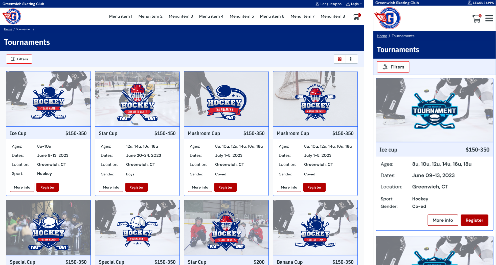
Before
After
Tournament registration is highly used on the LeagueApps platform which provided a wealth of ways to collect information on how to improve it. We initially began by putting together a focus group of internal stakeholders, mainly from Customer Success and Sales, to understand what our customers want and need.
After collecting that baseline information, we were able to put together a survey to ask questions to both confirm some of our stakeholders hypothesis’, and to gather information on parts that we thought were confusing in our various explorations. Once we analyzed the data set, we began constructing a script to start our user interviews to dive deeply into the wants and needs of our customers. After mapping out some of the most common responses, we felt confident in what we believed our customers wanted out of the Next-gen product.
In tandem with the external and internal interviews, I also did extensive competitive research. I looked at both direct competitors and other platforms that excel at complex registration scenarios. When analyzing these various platforms I took screenshots and annotated what I thought worked and what I thought didn't work. This analysis gave me some good patterns to keep in mind as I entered the early design phases.
As we created design artifacts, we consistently reviewed with our internal stakeholder team and our customers. Each round of reviews led to new revelations and improvements to the overall experience.
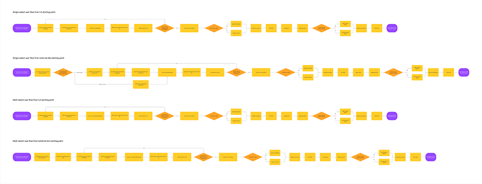
I value user flows as one of the most important tools when creating a seamless user experience. At the beginning of the project, I took initiative to recreate the existing flow and sought validation from internal stakeholders to ensure its accuracy. Subsequently, I meticulously examined the flow, identifying gaps and areas that could benefit from enhancement, ultimately developing a next-generation version. As our research progressed, this flow underwent significant changes in response to a better understanding of our customers' pain points. Additionally, I revisited and fine-tuned the flow multiple times during the development phase, seeking opportunities for optimization based on insights from our engineering team.
We wanted to ensure our we had a flow that worked for the following:
I strongly advocate for the use of iterative experimentation in my design work. My preferred method is to sketch out initial designs on paper in order to convey my ideas in a genuine and organic manner. Additionally, I utilize wireframes to quickly develop designs that can be shared and discussed amongst my teams and stakeholders. Throughout this particular project, I engaged in numerous iterations until I arrived at a solution that resonated effectively with our users. Below, you can find my most recent wireframe as well as a few alternative versions that were explored. If you go into the Figma file you can see the numerous versions and experiences that were explored early in the project.
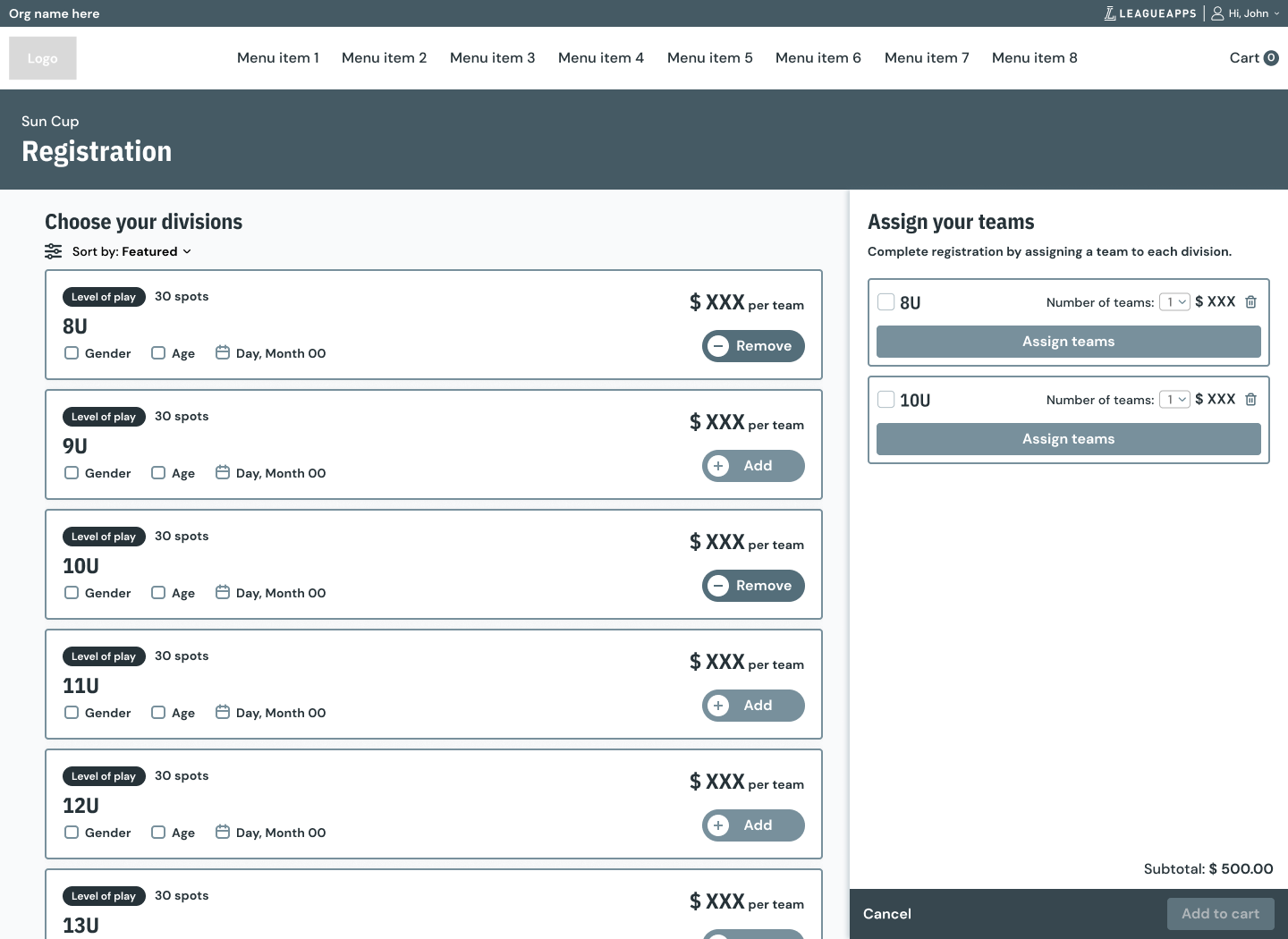
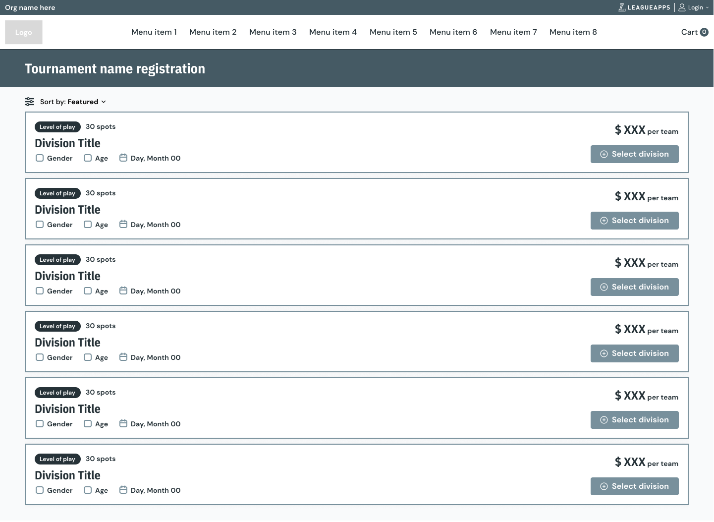
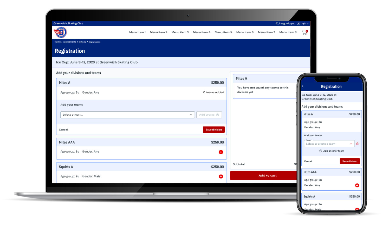
Although bulk registration was the main feature we were adding to the platform we also had the opportunity to address a few other parts of the experience that touched the new registration service. In the original MVP we stripped the experience down to the absolute essentials and added more of the bells and whistles in the following quarters.
The initial feature set was:
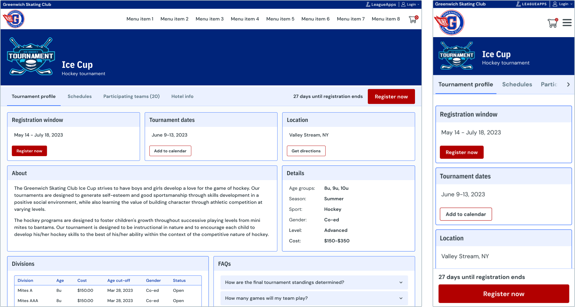
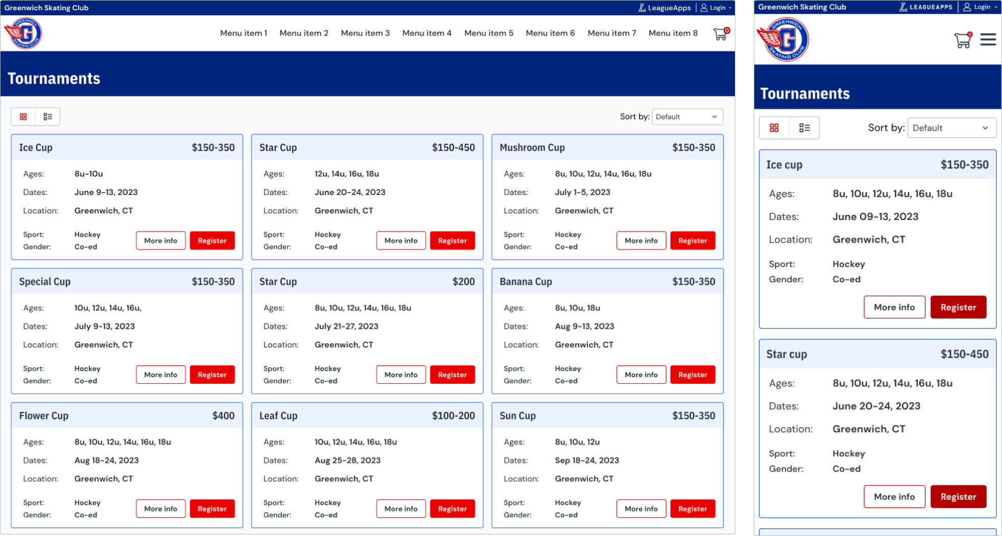
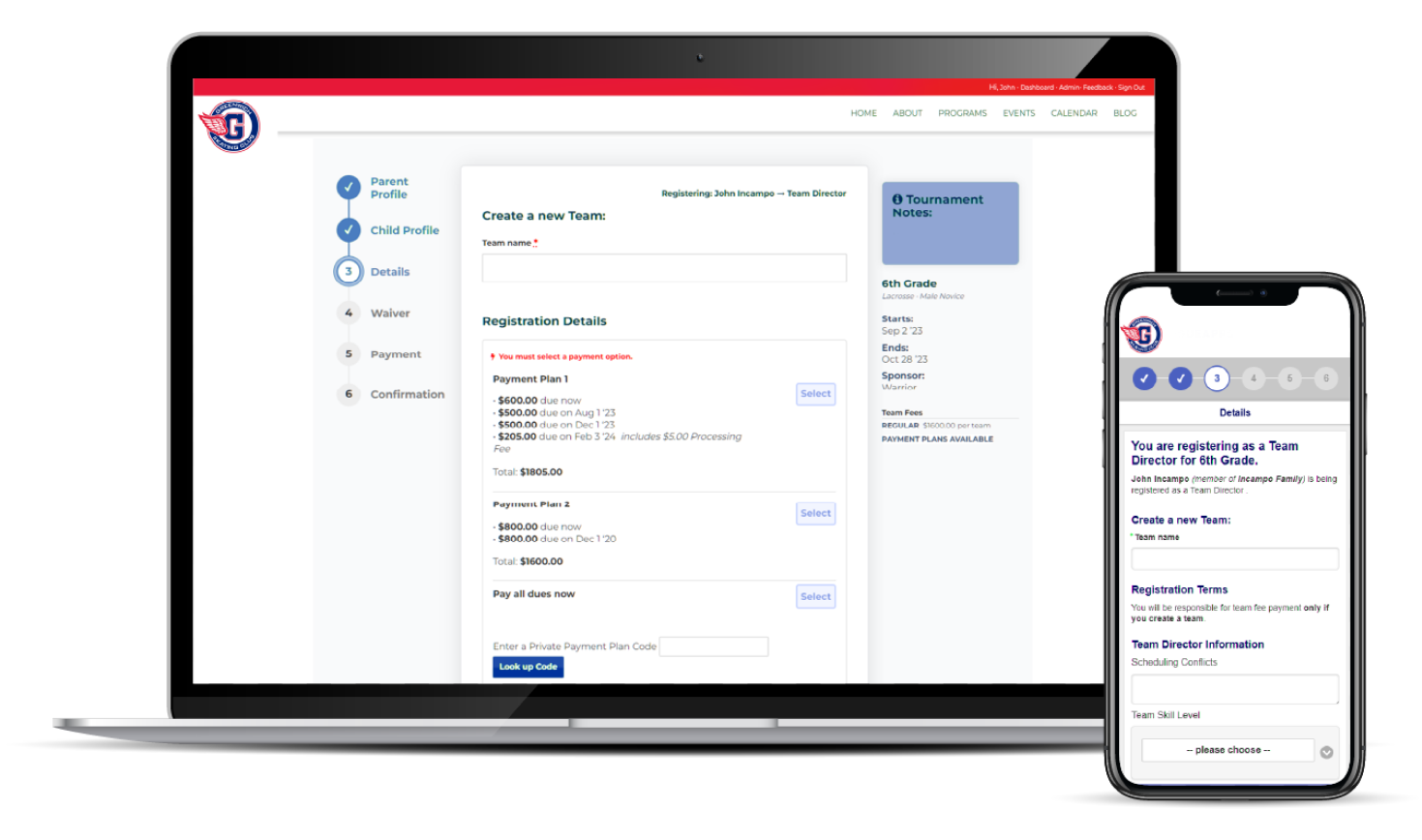
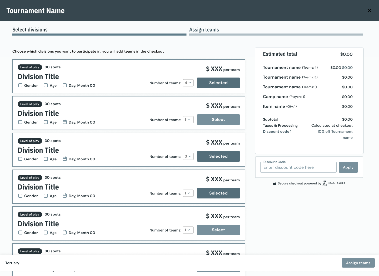
While the Minimum Viable Product (MVP) brought significant enhancements to the user experience, the subsequent improvements after the MVP phase introduced additional features that customers greatly appreciate. We built upon the fundamental layouts by incorporating more customizable options and components that we believe will significantly streamline the registration process for members and provide organizers with time-saving benefits.
Introduced the following improvements:
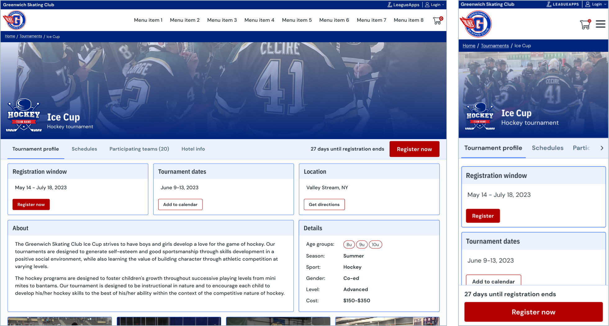
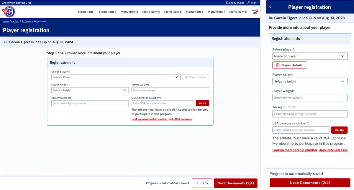
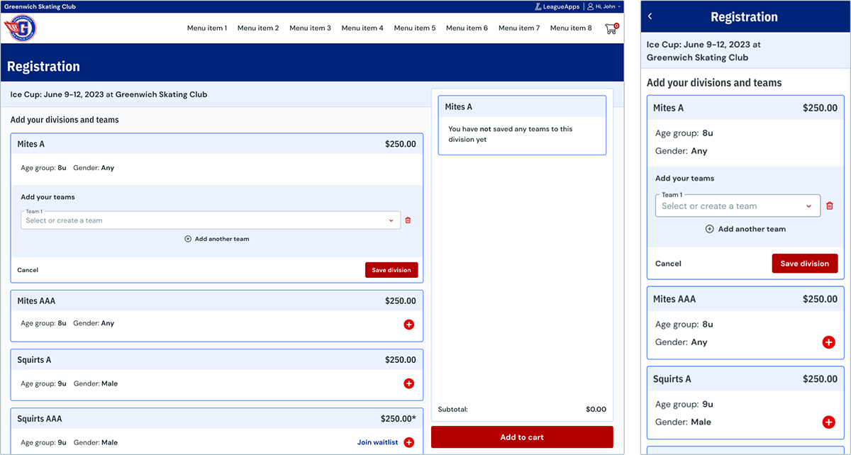
Upon the launch of both the MVP and Post-MVP for bulk registration, we opted to utilize the existing registration flow for player registration. which was part of the legacy experience where the essential features were housed. The required features were inherent in the legacy experience, while the bulk functions introduced in the initial MVP required development. Our overarching goal was to establish a contemporary, user-friendly registration system with enhanced aesthetics. We opted for a mobile-first design approach, recognizing that player registration was more likely to be conducted on mobile phones compared to bulk team registration.
Introduced the following improvements: