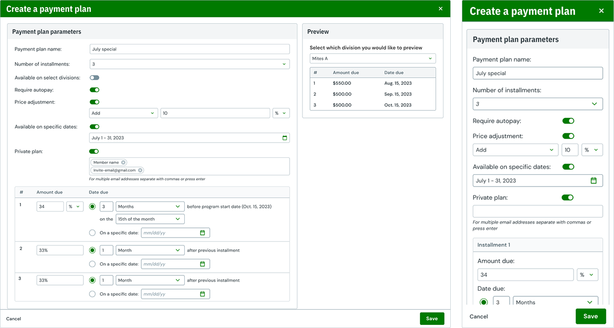
The previous payment plans setup involved a significant amount of repetitive tasks to generate all the necessary plans for a single program. Moreover, these plans often involved complex calculations as they were based on dollar values rather than a percentage of the program's total. Consequently, they were not easily adaptable for future use. Our organizers consistently expressed that this process was extremely time-consuming, to the extent that they had to hire resources specifically for this task.
We expanded upon the insights gained from the minimum viable product (MVP) release of the new cart and checkout system. Through diligent effort, we have developed a payment plan experience that surpasses even the most reputable financial institutions. Our team applied innovative thinking, rigorous testing, and dedicated development to introduce program-level payment plans, a feature absent in the previous version of our system. Additionally, we ensured that these plans are reusable and capable of handling private and prorated plans. As a result, we have enhanced the user experience, leading to increased productivity.
Featured the following improvements:
Lead product designer
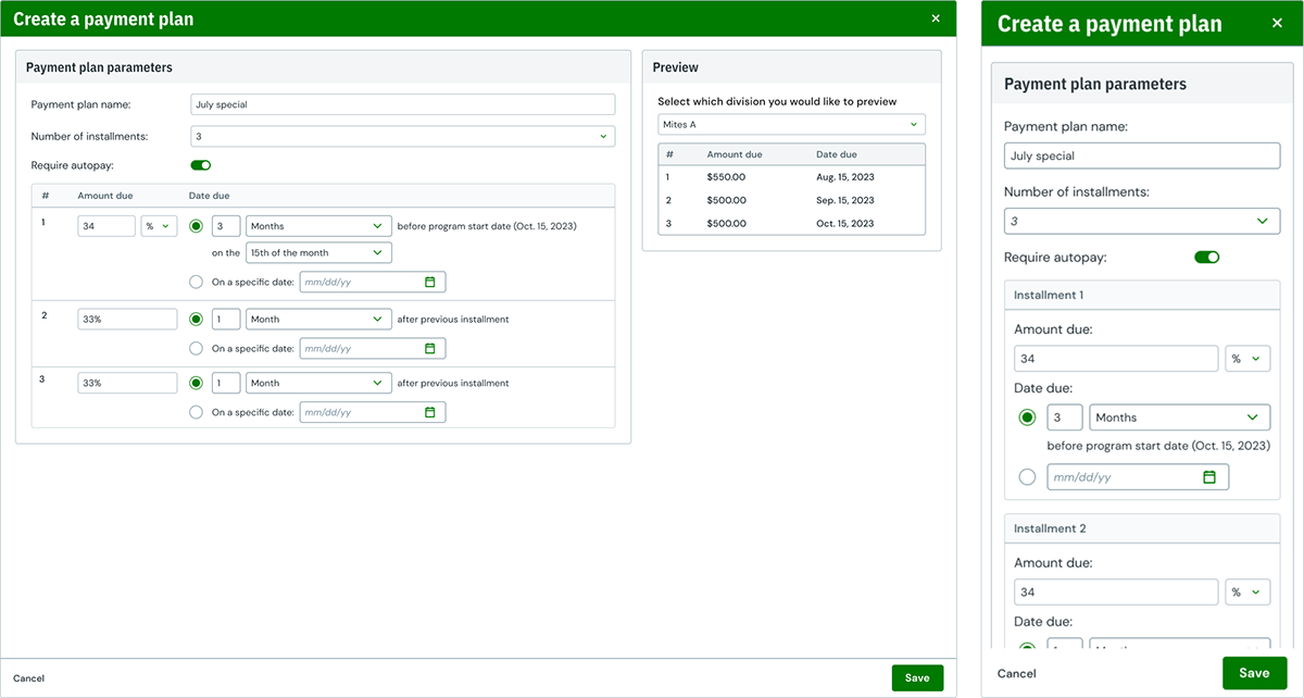
Use slider to transition between legacy and next-gen experiences.
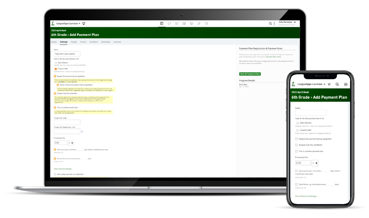
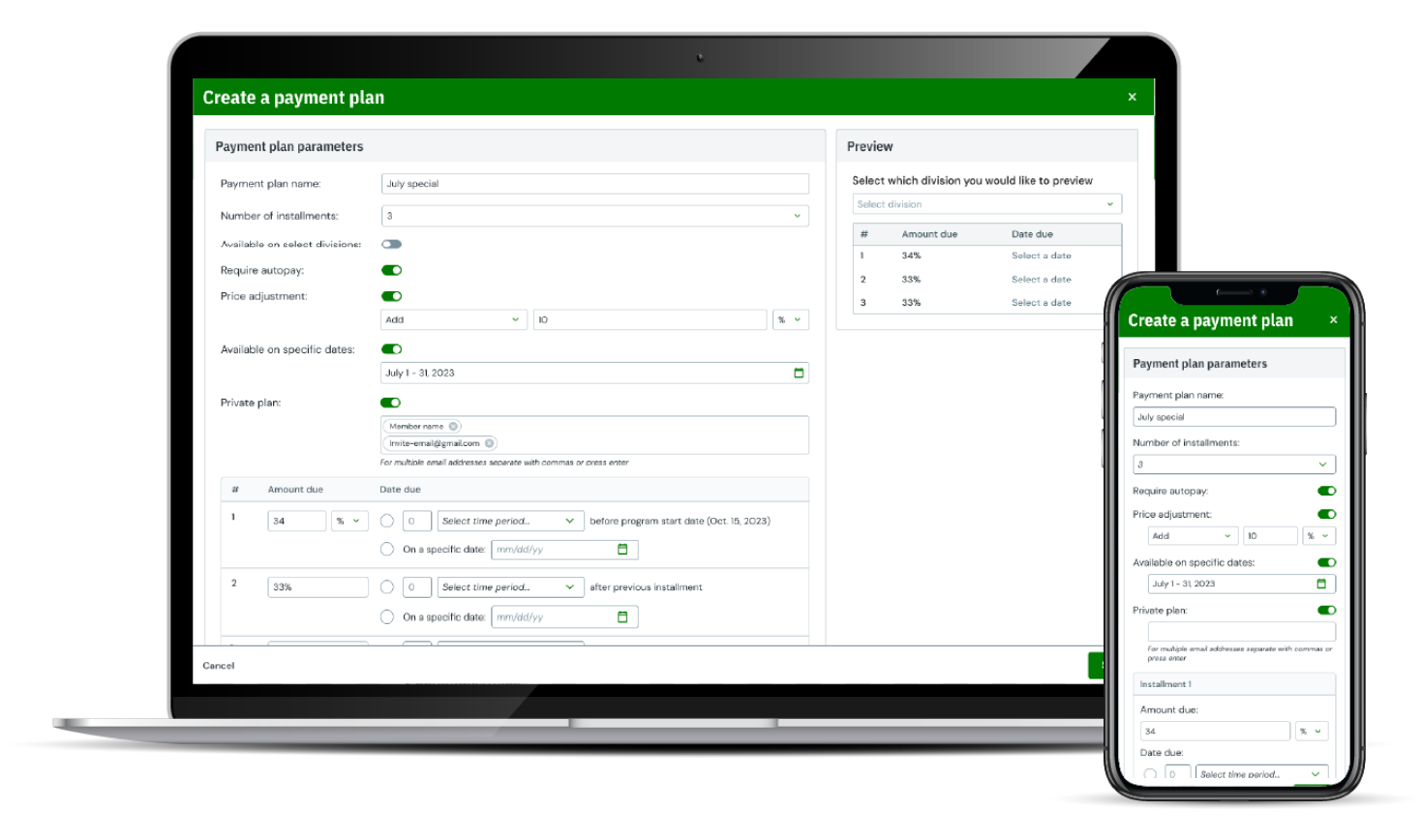
Before
After
Given the high utilization of payment plans, our initial step was to engage our data team to extract the relevant usage data from our platform. This data provided insight into various aspects of payment plans, including the number of plans in use, the customer segments that utilized them the most, as well as the payment deadlines and amounts. Analyzing this data was crucial in determining the viability of this solution. Notably, two key findings emerged from our analysis: firstly, our largest customers displayed the highest usage of payment plans, and secondly, there was a recurring use of identical price and deadline combinations across multiple plans. The latter discovery was particularly intriguing and played a pivotal role in our redesign efforts.
In this project we decided to lean on a combination of our internal stakeholder feedback and competitive research to create an early version of what we were looking to achieve before we went out to our users. We looked at how some of our competition handled payment plans, but really felt like looking at more financial institutions would yield a better solution.
We started with feedback sessions with our customer success team, they are often tasked with setting up these plans for our partners so they have very good insights into the pain points. After analyzing the interviews and competitive research we put an early concept together and reviewed with our Customer Success team to see how they would react to the radical changes to how we want to handle the plans.
Payment plans are another highly used feature, one that has caused a lot of pain, so organizers were jumping at the chance to tell us all the issues they had with them. So when we did our interview sessions we really listened to all the drawbacks they found in the current solution, these generally aligned with the CS feedback. After we have heard all there use cases and grievances we showed them our early designs and elicited feedback.
Each session led to more improvements to the design and by the end of all our sessions we felt confident in the first version of the product we wanted to release. We continued to do research post MVP and as we released the various Post-MVP improvements.
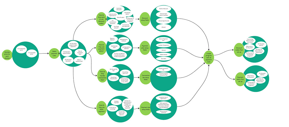
In this project, I decided to use a task flow instead of a user flow. They are very similar processes but the task flow has the added level of detail which shows all the options that the user would encounter each step of the way.
.jpg)
.jpg)
.jpg)
This product is building upon my previous work on the Next-gen settings page and the components added to the design system from that, I used some of those elements as my wireframes. So although they dont look like traditional wireframes they were put together with the same intent, quick and iterative designs to start a conversation. Even though I had more design system elements at my disposal, this did not stop me from sketching to really make sure the order and flow felt natural.
In order to release this feature in a timely manner, we released a barebones version of the product to begin receiving feedback. We needed to decide what were the most important features in our first version to help support our new tournament registration product.
The initial feature set was:
While the MVP was a significant improvement to the OG payment plans flow, we knew there was a lot more we could do to improve our organizers lives. We had prioritized a number of features based upon our research and wanted the next release of features to really hit our customers needs.
Some of these improvements are as follows: