The legacy settings structure presented a lengthy list of nested checkboxes and inputs, which proved to be overwhelming for our users and subsequently led to an increased reliance on customer service for support. In order to address this issue, we made the decision to redesign the process by focusing on the Registration Options page, with the intention of subsequently applying the changes to all other settings pages. This particular page was selected due to its frequent usage by users and the numerous difficulties encountered.
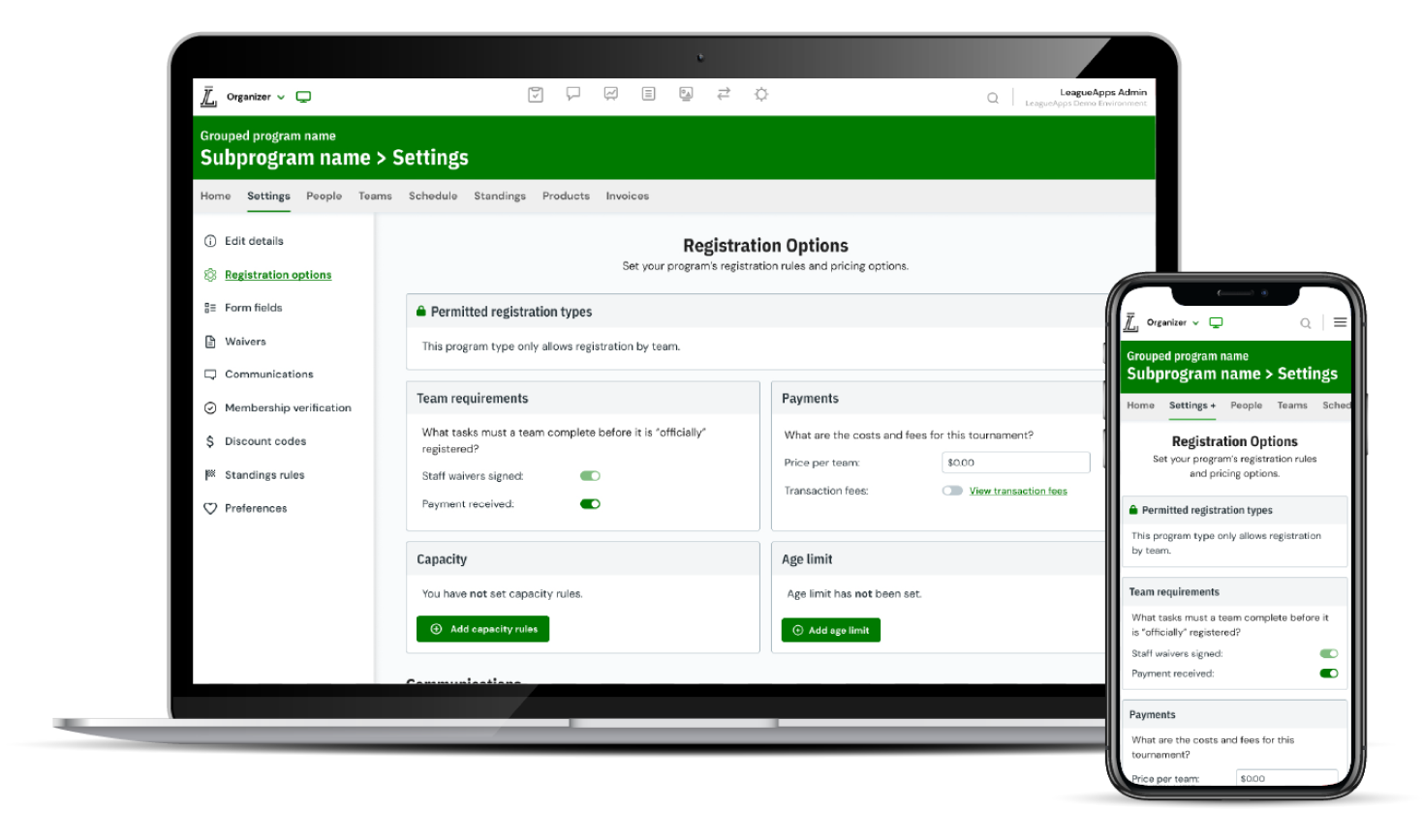
Our solution was the result of a comprehensive approach incorporating interviews, research, and rigorous testing. We developed a contemporary settings structure that could easily be implemented across all settings pages on the platform. This entailed grouping the settings based on their respective functions, prioritizing the most frequently used settings, simplifying complex language to enhance clarity, and implementing a card structure that formed an essential component of our design system.
Featured the following improvements:
Lead product designer
Use slider to transition between legacy and next-gen experiences.
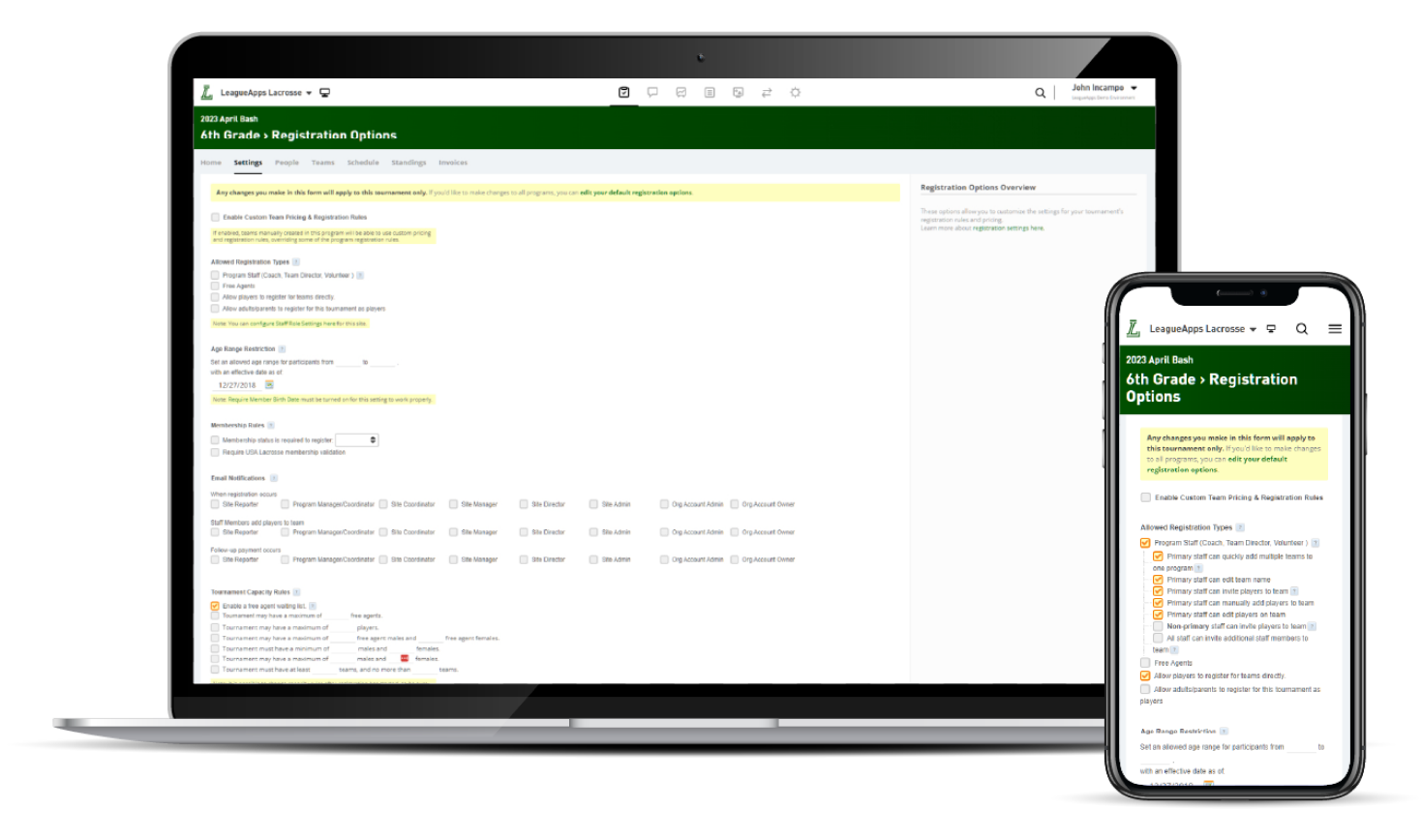
Before
After
When starting this project we utilized multiple approaches to gather some baseline information. The first thing we did was reach out to our data team to pull the data on the Registration Options page to get an idea of the usage of each individual setting. The data helped to inform us of which settings needed to be higher up on the page and which potentially were not necessary.
The second was to interview our internal CS team to get a better idea of how each of the settings were used and what the most valuable use cases were. We also got to hear how they use them to “hack” the system to do things they weren't intended to do. Since we already had pulled the data, we had some things we could run by the team to see if they anecdotally agreed with the data. Overall these sessions were some of the most valuable as the CS team often is tasked with setting this page because it confused our partners so much.
Thirdly, I began doing some competitive design research. I looked at how our direct competitors handled their settings pages, although their design patterns were quite lackluster. I found a lot more inspiration in how big technology companies handled their complex settings pages. The benefit to using these as inspiration is that you know they have been thoroughly tested and iterated on due to their vast user base. I really found how Google handled their settings to be particularly effective.
Finally, once we had some initial prototypes together based on all the previous research we went out to some of our users for some usability tests and user interviews. We received a generally positive reaction, especially compared to the legacy design.
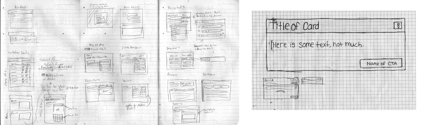
When starting this project our design system had only just started being worked on. So, the entirety of the page and all the components in it were meant to be added to the design system. This meant sketching was even more important than it normally is since I had to create the visual design element of the design from scratch. I spent a lot of time sketching and experimenting in Figma on how the page layout should be as well as how the card itself should look. The card would go on to become a foundational piece in our design system so all the work on it was definitely worth it. Below you can see some sketches as well as some early design experimentation.
This minimum viable product (MVP) was designed to complement the launch of our new tournament registration experience. As a result, we made adjustments to the number of settings available to align with the functionality provided in the registration process. We also faced time constraints that prevented us from implementing a sidebar as an alternative to the settings dropdown.
The initial feature set included:
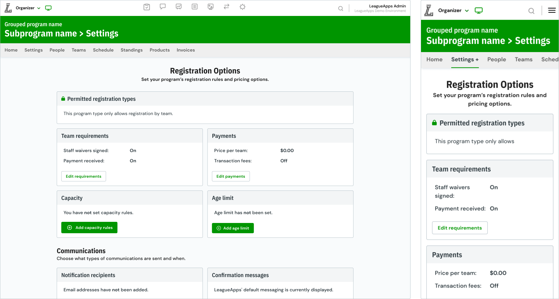
After the release, we conducted additional rounds of interviews and usability tests and identified that users frequently desired the ability to edit multiple cards concurrently. To address this need, we transitioned from a module editing system to an inline editing system. Initially, we had concerns about the potential increase in workload, but by implementing an edit state for each card, we were able to maintain users' focus on their intended tasks. Moreover, we had sufficient frontend resources to make some quality of life improvements that further enhanced the overall user experience.
Some of these improvements are as follows:
