The previous version of our theme editor and member shell had unintended consequences for our product. It allowed users to customize their program pages extensively, which may initially appear positive. However, this customization led to various issues such as platform instability, inconsistent design language, and numerous bug fixes. From a business perspective, the LeagueApps brand was not prominent enough. In fact, during interviews with members, many were unaware that they were using our platform. Our goal was to establish a cohesive appearance while still showcasing our partners' brands. We also aimed to enhance the member shell's responsiveness, as the previous system was adaptable but lacked consistency with the desktop version. This inconsistency resulted in numerous customer complaints. It was a delicate balance to achieve, but we successfully accomplished it through a well-executed design strategy.
Our solution was the result of extensive research, input from members and internal stakeholders, as well as the implementation of design best practices. We initially focused on creating a design that would address all of the previously mentioned issues, and then proceeded to develop the theme editor to incorporate brand inputs.
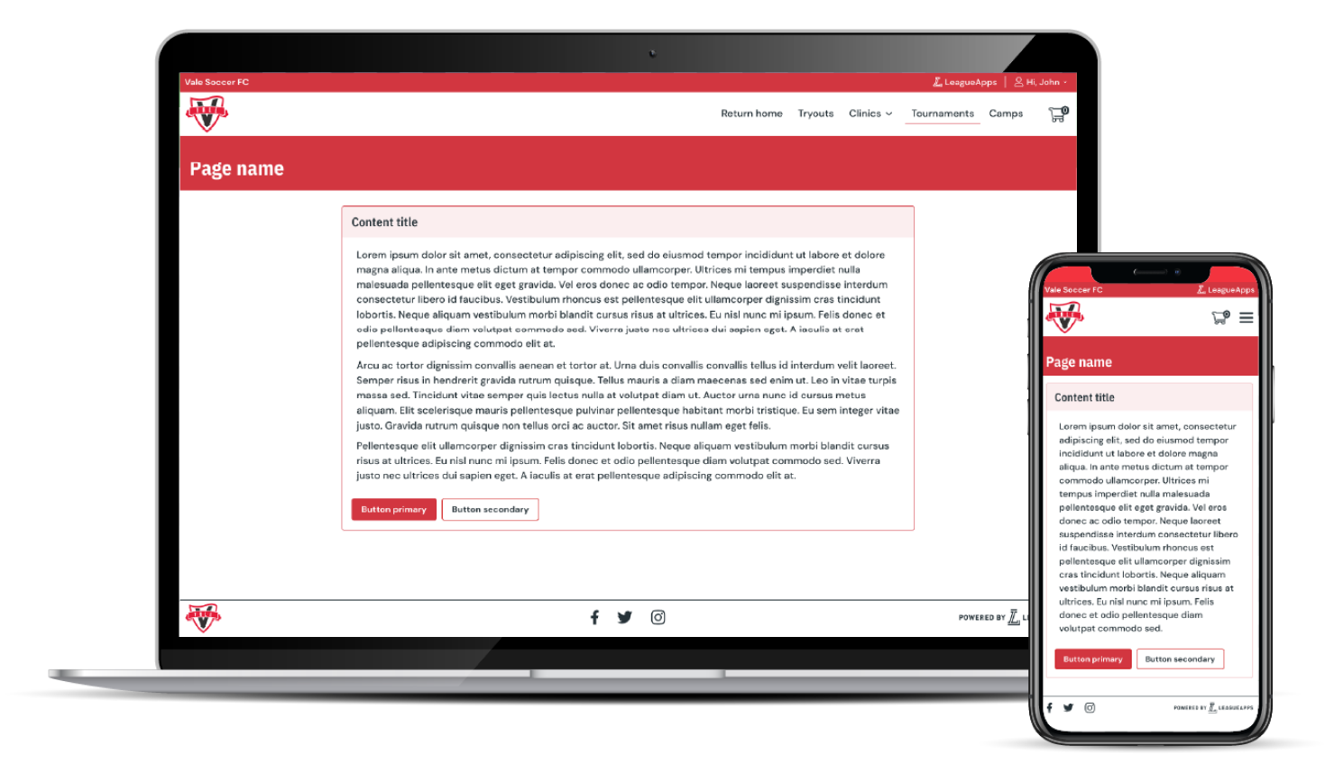
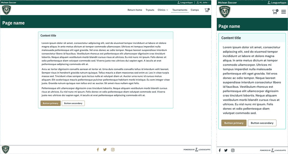
The end result was a modern, responsive, and user-friendly member shell that seamlessly represented the visual identity of LeagueApps. While each site maintained its distinct brand identity, they also adhered to the newly established LeagueApps design system. We utilized our design system components, but applied a branded color palette based on the feedback of only a primary and secondary color, transforming all our grays into slightly tinted versions of their respective colors. This resulted in a harmonious and recognizable overall aesthetic. Additionally, we strategically incorporated the LeagueApps logo in key areas such as the login and checkout buttons, to help establish trust and security. Through these efforts, we successfully elevated the LeagueApps brand without compromising our partners' individual brand identities.
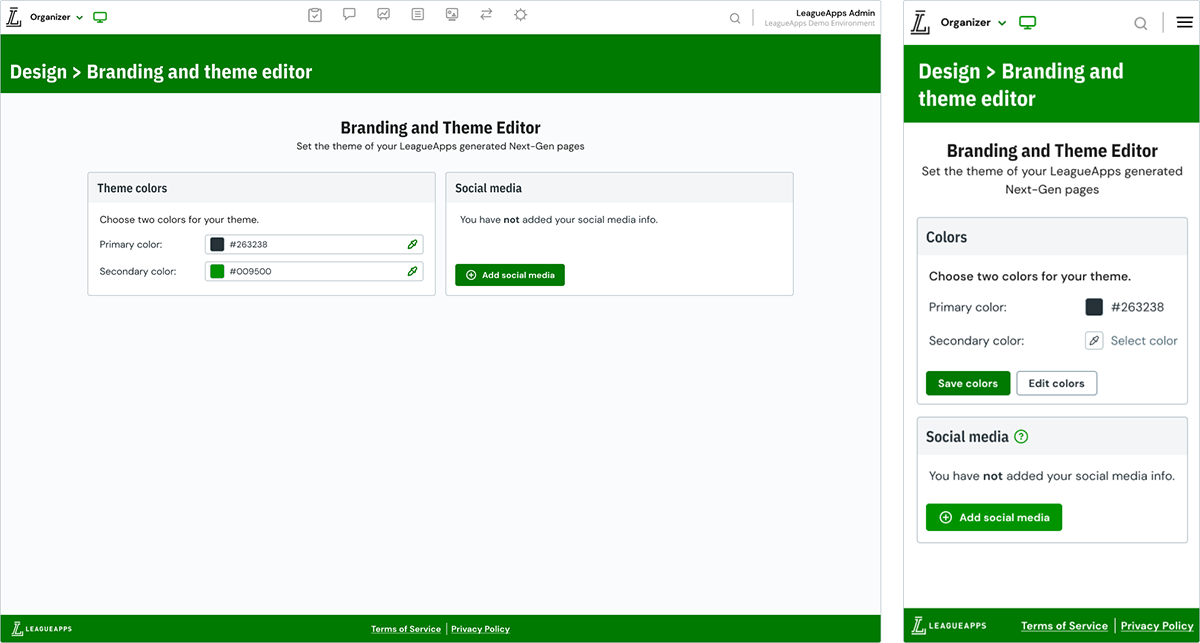
When it came to the theme editor, we utilized the Next-gen settings template that we had previously established in order to lay the groundwork for the new theme editor. Our plan was to enhance its functionality and ultimately implement a preview feature and more advanced configurations.
Lead product designer
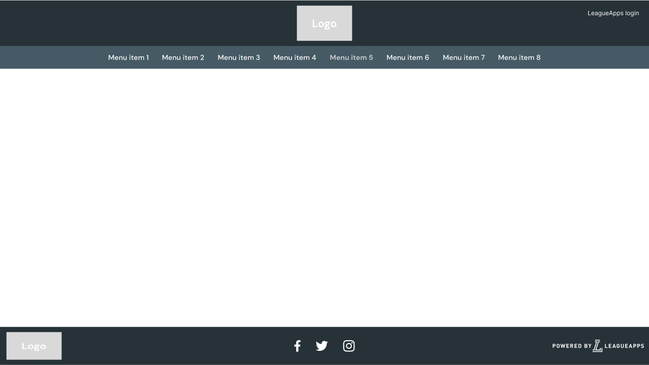
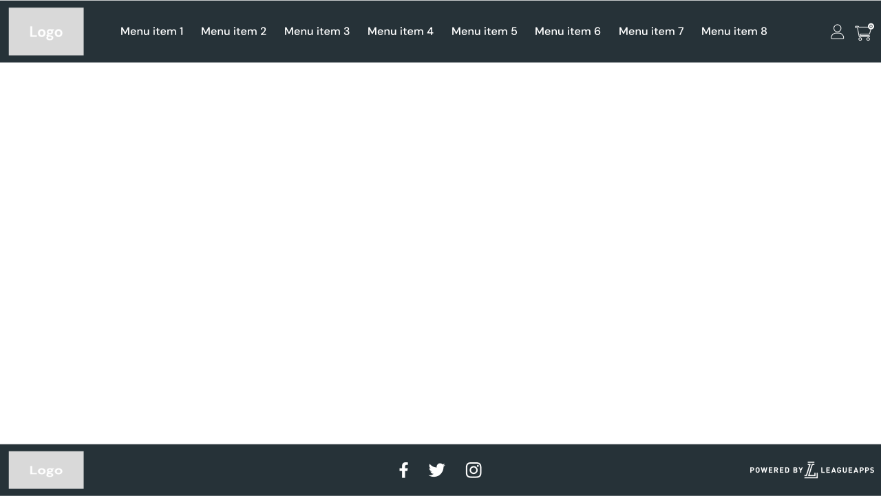
Use slider to transition between two different org brands.
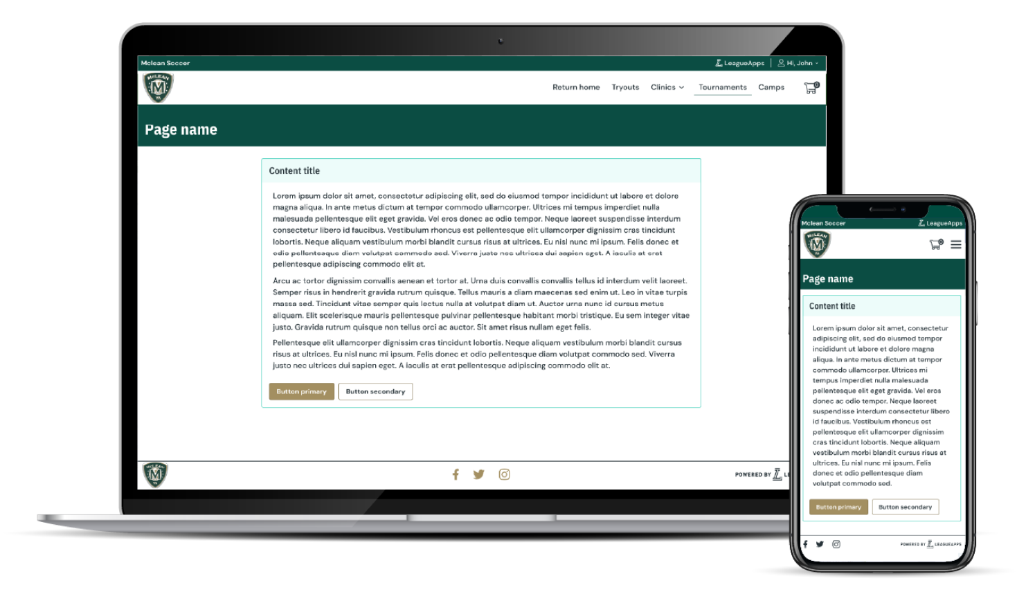
Org 1
Org 2
In order to ensure the success of our projects, we actively engage our internal team members who possess extensive knowledge about these products. We rely on our customer success, support, sales, and design shop teams to provide valuable insights regarding existing customizations and identify what they perceive as vital for our partners'.
Through a collaborative effort among various teams, we successfully extracted and arranged all the customizations utilized in the outdated product. After analyzing their usage, and leveraging insights from our internal team, we were able to determine which customizations should be prioritized as configuration for the minimum viable product (MVP), while others could be deferred for future development.
After completing the mentioned research phases, we were able to develop a survey and script to communicate with both members and organizers. It was crucial to gain insight on how both groups perceived both the existing and future solution. We thoroughly examined the member experience in terms of both abstract aspects and practical examples and visuals. Ultimately, we analyzed the responses and found an optimal balance between customization and standardization.
During my research, I extensively utilized available resources in the e-commerce industry. I examined e-commerce platforms across multiple sectors, with a specific emphasis on highly trafficked websites. Although each e-commerce site had its own distinct style, I noticed certain recurring trends. Additionally, I dedicated considerable time to studying Shopify, the leading company in providing themed shopping experiences, in order to identify areas for potential improvement. As part of the analysis process, I captured screenshots of these platforms and collaborated with my teammates to evaluate their strengths and weaknesses. This critical examination yielded valuable insights that I incorporated into the initial stages of our design process.
In every project I contribute to, I am purposeful in ensuring that the design process undergoes consistent reviews by key stakeholders. This fosters team unity and guarantees the inclusion of all essential elements.
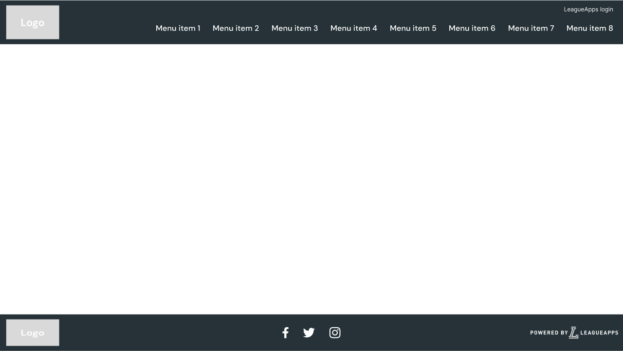
In this project, I utilized my expertise in web design, drawn from my previous experience at Design Shop, to guide my initial designs. I also considered web best practices, particularly when deciding the layout of the header and footer, as it is important to build upon established patterns. I iterated through multiple layouts before finalizing the one that went into production. You can find a few selected wireframes below or explore my early design work in the Figma link provided.
When determining the contents of the Minimum Viable Product (MVP), we recognized the importance of establishing several foundational shell components. We identified a few key items that needed to be prioritized swiftly to ensure timely delivery of a high-quality product.
The initial feature set was:
The primary objective of the theme editor Minimum Viable Product (MVP) was to establish a solid groundwork for a more sophisticated and comprehensive system. The ultimate goal was to completely phase out the outdated legacy theme editor. Our primary emphasis was on developing essential functionalities to facilitate the integration of the user interface and themed components utilized in member-facing pages.
The initial feature set was: