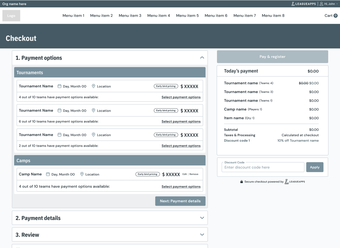
The previous version of LeagueApps did not incorporate a genuine shopping cart and checkout system, a standard expectation in e-commerce enviroment. Each transaction was managed separately and treated as an independent entity. In the past, efforts were made to establish a looping process for this purpose, but it resulted in a subpar user experience. Within the Payments team, we were tasked with revamping and streamlining this process to enable users to make large-scale purchases more easily.
We applied and built upon the research conducted for the tournament registration experience to develop our new modern checkout flow. Our aim was to create a seamless registration process for the Next-gen tournaments, improving the user experience by aligning with current industry standards for checkout practices. In addition, we designed attractive visual layouts for member-facing pages and ensured that traditional bulk purchases could be easily made through the cart and checkout process. Moreover, this initial implementation laid the foundation for incorporating new payment plans, discounts, and add-ons.
Featured the following improvements:
Lead product designer
Use slider to transition between two different org brands.
Org 1
Org 2
This project relied heavily on competitive research, especially in the early phases of the design. I gathered both direct competitors and e-commerce titans when looking at the best approach to a checkout flow. I found, unsurprisingly, that the large e-commerce companies had a superior design and experience to other youth sports companies. Though the sports company had to deal with some additional complexities that I would have to face in my project that made the analysis valuable.
The checkout flow was being designed and developed in tandem with the new tournament registration flow and at different stages were much more integrated. Due to this, the design reviews were done simultaneously early on. We primarily did wireframe reviews with our internal stakeholders: engineering, customer success and sales. After a few rounds of revisions, heavily influenced by the early reviews, we began to separate the flows more to the point where we reviewed each more individually. Although we always walked through how they work together, they were both interconnected by nature.
Once we had done a few internal reviews, we went out to a group of our users to gain feedback on the flow. When we started these sessions they were primarily wireframes as I was still working with my team to create the Next-gen design languages. We found the users feedback to be generally aligned with our internal team and were excited for this new experience for their members.
As we got closer to what would be the MVP we began doing true usability tests and making incremental improvements to the flow as we noticed patterns in the feedback developing. We continued this testing through the release of the MVP and into the release of the Post-MVP features.
User flows are typically one of the initial design artifacts I create. Prior to conducting research or delving into the product, I find it beneficial to visualize how it may function naturally. However, after conducting further research and interviews, these initial assumptions often evolve. With regard to this project, the early stages involved working on both the tournament registration flow and the overall user flow together. Over time, they were separated to some extent, but they still remained interrelated, as one flow relied on the other.
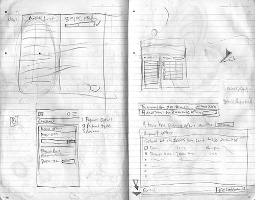
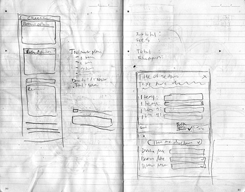
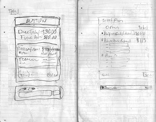
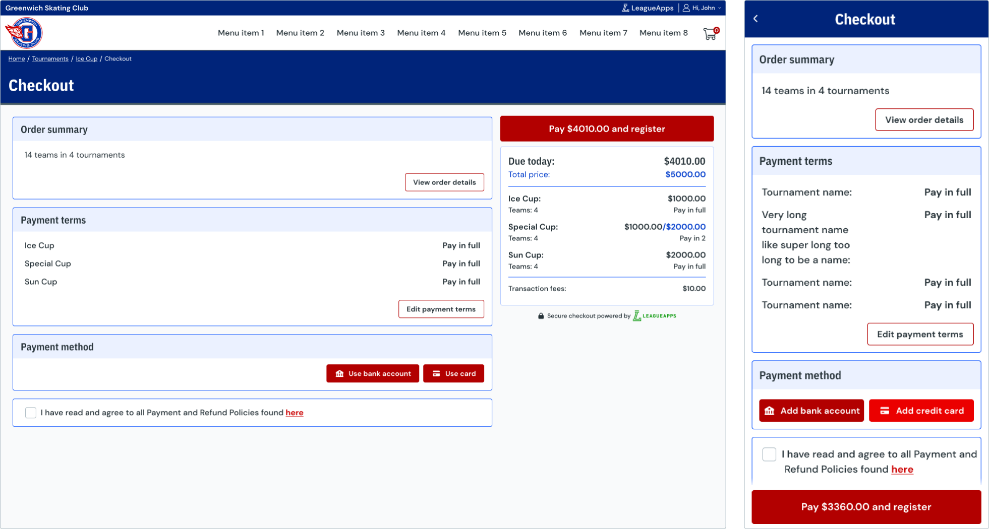
At the start of the project, our design system was in its early stages of development. Therefore, all elements of the page, including components, needed to be designed from scratch. This emphasized the significance of sketching and wireframing, as we tested early versions of the designs they were often in these formats. I enjoy focusing on the flow and worrying about the visual design as the icing on the cake. In early designs, I was focused on the desktop and getting all the info that was needed there. As the design developed I took a step back and took a mobile first approach to see how I can fit all the info in the most condensed way and then iterated my desktop versions based on that.
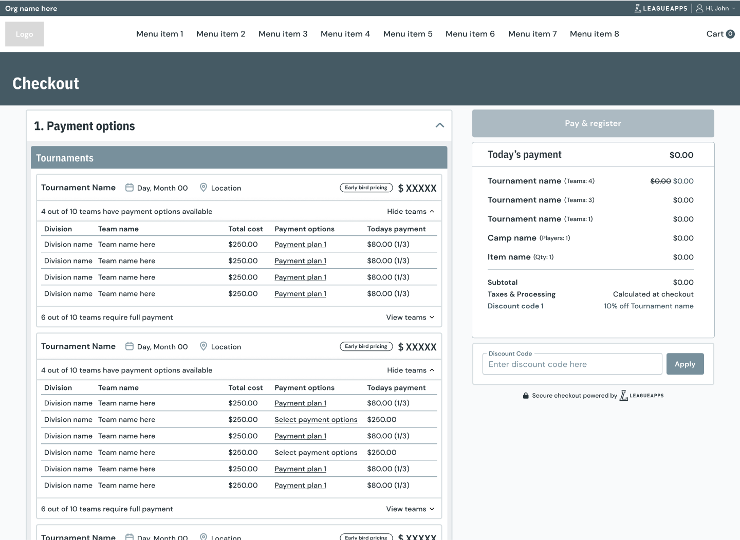
The MVP was to be released to be paired with the MVP of tournament registration. Due to this the amount of settings itself was stripped down based on the capabilities being offered in the registration workflow. Though, due to the velocity of the squad, we were able to release our MVP much earlier and do comprehensive testing before the first version of the registration flow was finished.
The initial feature set was:
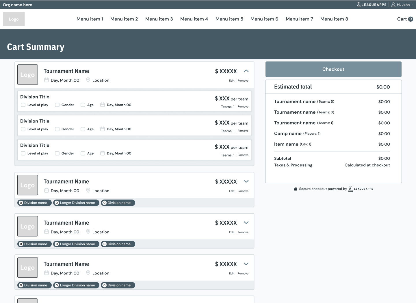
Our first version of the cart and checkout experience was successful, so much so that user wanted it extended across all program types. Unfortunately, the backend development to achieve that would take us more time and relied on some other squads work. We did have plenty of things we heard in testing that we could act on. One being moving from a module editing system to an inline editing system in the cars, due to some learnings in the NG settings page release. We also had the opportunity to add a few bells and whistles and begin releasing our next fast follow feature of payment plans.
Some of these improvements are as follows: